Bottom Sheet
Description
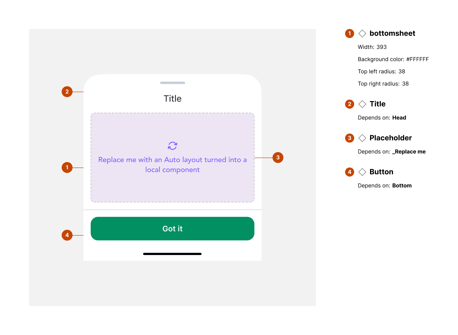
The Bottom Sheet is a modal surface that slides up from the bottom of the screen to display contextual actions, menus, or additional information without navigating away from the current screen. It is commonly used for quick actions, selections, or displaying complementary content.
Variants & states
Variants
-
Standard: Simple container with content or actions.
-
With menu items: Includes multiple selectable options or icons.
-
With home indicator spacing: Designed for iOS devices with bottom gesture navigation.
-
Full-height sheet: Expands to nearly full screen for more detailed content.
States
-
Default: Collapsed initial state.
-
Expanded: Full height or larger content view.
-
Drag in progress: Visual feedback while dragging.
-
Dismissed: Fully hidden when closed.
Anatomy
-
Container (sheet body):
-
Height: variable (standard ~83px minimum)
-
Background color: #FFFFFF
-
Border color: #000000 (10% opacity)
-
Border top weight: 0.5px
-
Rounded top corners
-
-
Menu items:
-
Icon and/or label for actions
-
Horizontal alignment: center
-
-
Home indicator area:
-
Safe area spacing for devices with gesture navigation
-
Maintains clear interaction zone
-
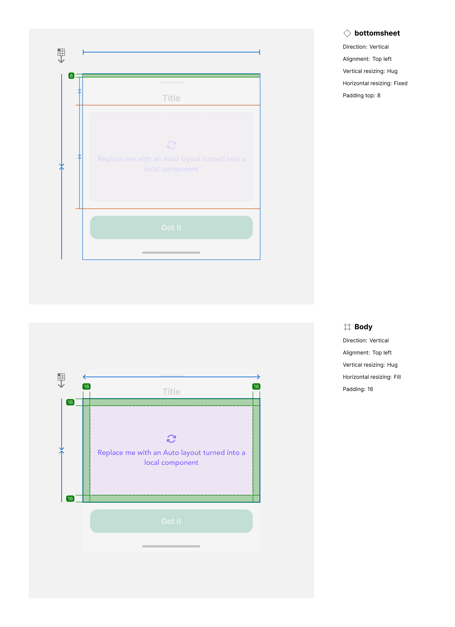
Layout and spacing
-
Direction: Vertical stack (sheet slides upward)
-
Alignment: Centered content (menu items horizontally aligned)
-
Padding:
-
Top: 12px
-
Side padding: 8px (left/right)
-
Bottom safe-area padding: 8px (adjusts for iPhone Home Indicator)
-
-
Item spacing: 12px between interactive elements
Usage guidelines
Do ✅
-
Use for supplementary actions or contextual options.
-
Ensure smooth transition animations when opening or closing.
-
Respect system safe areas (e.g., home indicator space).
Don’t ❌
-
Don’t overload with too many items — prioritize 3–5 primary actions.
-
Avoid making the sheet permanent; it should be dismissible.
-
Don’t use bottom sheets for critical blocking actions (use full modal instead).